Lecture 3
Introduction
In Module 3 of Prof. Wyner’s lectures, you saw a graph of Earned Run Average (ERA) against year. Also shown was a line connecting the average ERA in each year.
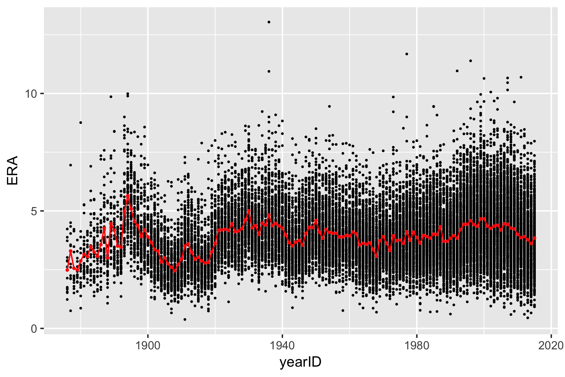
In order to create this figure we need to be able to compute the mean ERA in each year. In the previous exercises, you computed average statistics on a yearly basis by first filtering a tibble and computing the mean of the statistic each time. This was already quite tedious when you did it with the NBA shooting data spanning the 20 years from 1996 to 2016. Imagine trying to do that for each year between 1876 and 2015! Luckily there is an easier way in dpylr.
The Lahman Baseball Database
We will be using the Lahman Baseball Database.
We can load the Lahman database into R along with the tidyverse packages.
> library(tidyverse)
> library(Lahman)
We will focus on pitching statistics today.
> data(Pitching)
> Pitching <- as_tibble(Pitching)
There are tons of rows and columns in the dataset. For this exercise, we will only want to focus on ERA. We may use select() to pull out the relevant columns. In the Lahman pitching dataset, there is one column named ``IPouts’’ which is three times the number of innings pitched.
We will also focus only on those pitchers with at least 150 innings pitched. Unfortunately, the Lahman dataset does not include innings pitched. Instead, it includes a variable called ``IPouts’’ which is three times the number of innings pitched. Moving forward, we would like to use Innings Pitched, so let us add the column. We also only want to focus on ERA and can ignore the other columns.
> pitching <- Pitching %>% mutate(IP = IPouts/3) %>% filter(lgID %in% c("AL",
+     "NL") & IP >= 150) %>% select(playerID, yearID, teamID, IP, ERA)
> pitching
# A tibble: 9,318 x 5
   playerID  yearID teamID    IP   ERA
   <chr>      <int> <fct>  <dbl> <dbl>
 1 bondto01    1876 HAR     408   1.68
 2 bordejo01   1876 BSN     218.  2.89
 3 bradlfo01   1876 BSN     173.  2.49
 4 bradlge01   1876 SL3     573   1.23
 5 cummica01   1876 HAR     216   1.67
 6 deando01    1876 CN1     263.  3.73
 7 devliji01   1876 LS1     622   1.56
 8 fishech01   1876 CN1     229.  3.02
 9 knighlo01   1876 PHN     282   2.62
10 mannija01   1876 BSN     197.  2.14
# ... with 9,308 more rows
Grouped Operations
Instead of summarizing the entire dataset, it is often preferable to summarize the data of individual groups. For instance, we may want to know the average ERA within each year
> pitching.summary <- pitching %>% group_by(yearID) %>% summarize(mean = mean(ERA,
+     na.rm = TRUE), sd = sd(ERA, na.rm = TRUE), med = median(ERA, na.rm = TRUE))
> pitching.summary
# A tibble: 141 x 4
   yearID  mean    sd   med
    <int> <dbl> <dbl> <dbl>
 1   1876  2.42 0.840  2.49
 2   1877  2.78 0.805  2.6
 3   1878  2.32 0.868  2.06
 4   1879  2.57 0.522  2.44
 5   1880  2.33 0.710  2.14
 6   1881  2.76 0.535  2.54
 7   1882  2.76 0.514  2.64
 8   1883  2.79 0.771  2.7
 9   1884  3.04 1.02   3.04
10   1885  2.87 0.964  2.75
# ... with 131 more rows
We are now ready to replicate the plot
> ggplot(data = pitching) + ylim(0, 10) + geom_point(mapping = aes(x = yearID,
+     y = ERA), size = 0.3) + geom_point(data = pitching.summary, mapping = aes(x = yearID,
+     y = mean), col = "red", size = 0.6) + geom_line(data = pitching.summary,
+     mapping = aes(x = yearID, y = mean), col = "red")
Standardizing ERA
A Brief Introduction to Writing Functions in R
One really powerful feature of R is the ability to write your own function. Remember, how we can compute the mean, variance, etc? Unfortunately, there isn’t a nice function that returns a vector
> standardize <- function(x) {
+     (x - mean(x))/sd(x)
+ }
We can standardize all of the ERAs and plot them:
> pitching <- pitching %>% mutate(zERA_all = standardize(ERA))
> ggplot(pitching) + geom_point(mapping = aes(x = yearID, y = zERA_all), size = 0.3) +
+     geom_hline(yintercept = 0, col = "red")
What do we notice? First, virtually all of the standardized ERAs from the first several years are negative. This would suggest that some of the best pitchers of all time played well before 1900. This is a somewhat ridiculous statement.
Instead, it may be more useful to standardize within each year. We can add a new column to our tibble and then sort it based on the yearly standardized ERA (zERA_year).
> pitching <- pitching %>% group_by(yearID) %>% mutate(zERA_year = standardize(ERA))
> arrange(pitching, zERA_year)
# A tibble: 9,318 x 7
# Groups:   yearID [141]
   playerID  yearID teamID    IP   ERA zERA_all zERA_year
   <chr>      <int> <fct>  <dbl> <dbl>    <dbl>     <dbl>
 1 leonadu01   1914 BOS     225.  0.96    -3.00     -3.48
 2 martipe02   2000 BOS     217   1.74    -2.12     -3.16
 3 maddugr01   1995 ATL     210.  1.63    -2.24     -3.02
 4 luquedo01   1923 CIN     322   1.93    -1.90     -2.88
 5 martipe02   1999 BOS     213.  2.07    -1.74     -2.85
 6 brownke01   1996 FLO     233   1.89    -1.95     -2.82
 7 eichhma01   1986 TOR     157   1.72    -2.14     -2.81
 8 maddugr01   1994 ATL     202   1.56    -2.32     -2.79
 9 piercbi02   1955 CHA     206.  1.97    -1.86     -2.77
10 hubbeca01   1933 NY1     309.  1.66    -2.21     -2.77
# ... with 9,308 more rows
We see now that the best ERA was achieved by …
Of course, we might have decided to group players differently. We could, for instance, divide all of the data into different eras, a la Bill James:
- Pioneer Era: 1871 – 1892
- Spitball Era: 1893 – 1919
- Landis Era: 1920 – 1946
- Baby Boomer Era: 1947 – 1968
- Artifical Turf Era: 1969 – 1992
- Camden Yards Era: 1993 – present
To do this, we need to add an extra column to our tibble that records the historical era. We can do this with mutate() and the case_when() function as follows:
> pitching <- pitching %>% mutate(hist_era = case_when(yearID <= 1892 ~ "pioneer",
+     yearID >= 1893 & yearID <= 1919 ~ "spitball", yearID >= 1920 & yearID <=
+         1946 ~ "landis", yearID >= 1947 & yearID <= 1968 ~ "baby_boomer", yearID >=
+         1969 & yearID <= 1992 ~ "art_turf", yearID >= 1993 ~ "camden_yds"))
> pitching <- pitching %>% group_by(hist_era) %>% mutate(zERA_hist = standardize(ERA))
Lots of Exercises
- Repeat these types of calculations but with batting statistics – practice adding columns, filtering, grouping, plotting